Images
In the Bonus section we provide you
with cool effects and animations on different elements.
First up Images!!
Image Filters
Add visual effects like blur and contrast on images.
Greyscale
To apply greyscale filter use img-grey class.
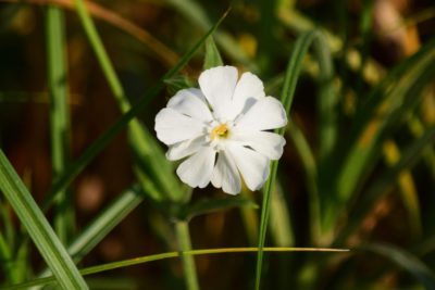
<img class= "img-grey" src="flower.jpg" alt="...">
Inverted
To apply invert filter use img-invert class.
<img class= "img-invert" src="flower.jpg" alt="...">
Blur
To apply blur effect use "img-blur-{scale}" class.
Here scale represents the scale at which you want to blur the image.
The scale of blur ranges from 1 to 5.
Example : img-blur-1,img-blur-2
upto img-grey-5.
<img class= "img-blur-5" src="flower.jpg" alt="...">
Contrast
To apply the contrast effect use "img-contrast-{scale}"
class.
The scale of contrast ranges from 25 to 100.
Constrast keeps increasing with "img-contrast-25"...
"img-contrast-50"... "img-contrast-75" and at
last... "img-contrast-100".
<img class= "img-constrast-75" src="flower.jpg" alt="...">
Saturated
To apply the saturation effect use "img-saturate-{scale}"
class.
The scale of saturation ranges from 1 to 5.
Saturation keeps increasing with "img-saturate-1"... "img-saturate-2"... "img-saturate-3"... "img-saturate-4"
and at last... "img-saturate-5".
<img class= "img-saturate-4" src="flower.jpg" alt="...">
Image overlay animation
Add hover animations on images.
Fade animation
Hover on the image below to see the overlay animation.
                           <div class="hover-img-container">
                                   <img src="..." alt="Avatar" class="image">
                                    <div class= "img-overlay">
                                       <div class="img-text">Text here</div>
                                    </div>
zoom animation
Hover on the image below to see the overlay animation.
                               <div class="hover-img-container">
                                       <img src="..." alt="Avatar" class="image">
                                        <div class= "img-overlay-zoom">
                                           <div class="img-text">Text here</div>
                                        </div>
Flip animation
Hover on the image given below to see the flip animation.
<img class="img-flip" src="flower.jpg" alt="...">
3-D Flip animation
Hover on the image given below to see the 3-D flip animation.
                                   <div class="img-flip-container">
                                   <div class="flip-container-inner">
                                   <div class="flip-container-front">


                                           <img src="..." alt="...">
                                           </div>
                                            <div class= "flip-container-back">
                                            <h2>Hello</h2>
                                         <p>Enter text here.</p>
                                               <div >
                                            </div>
                                            </div>